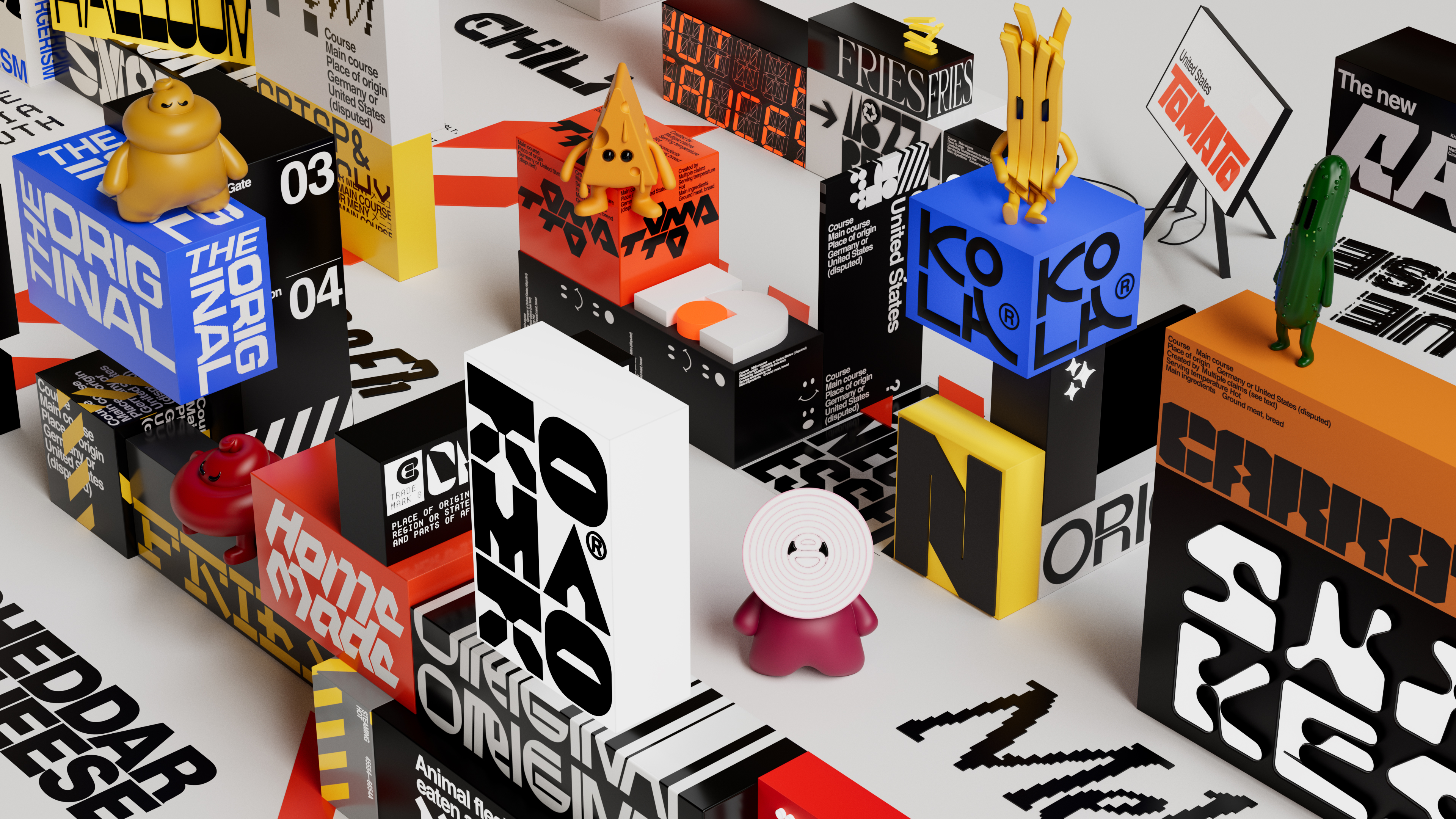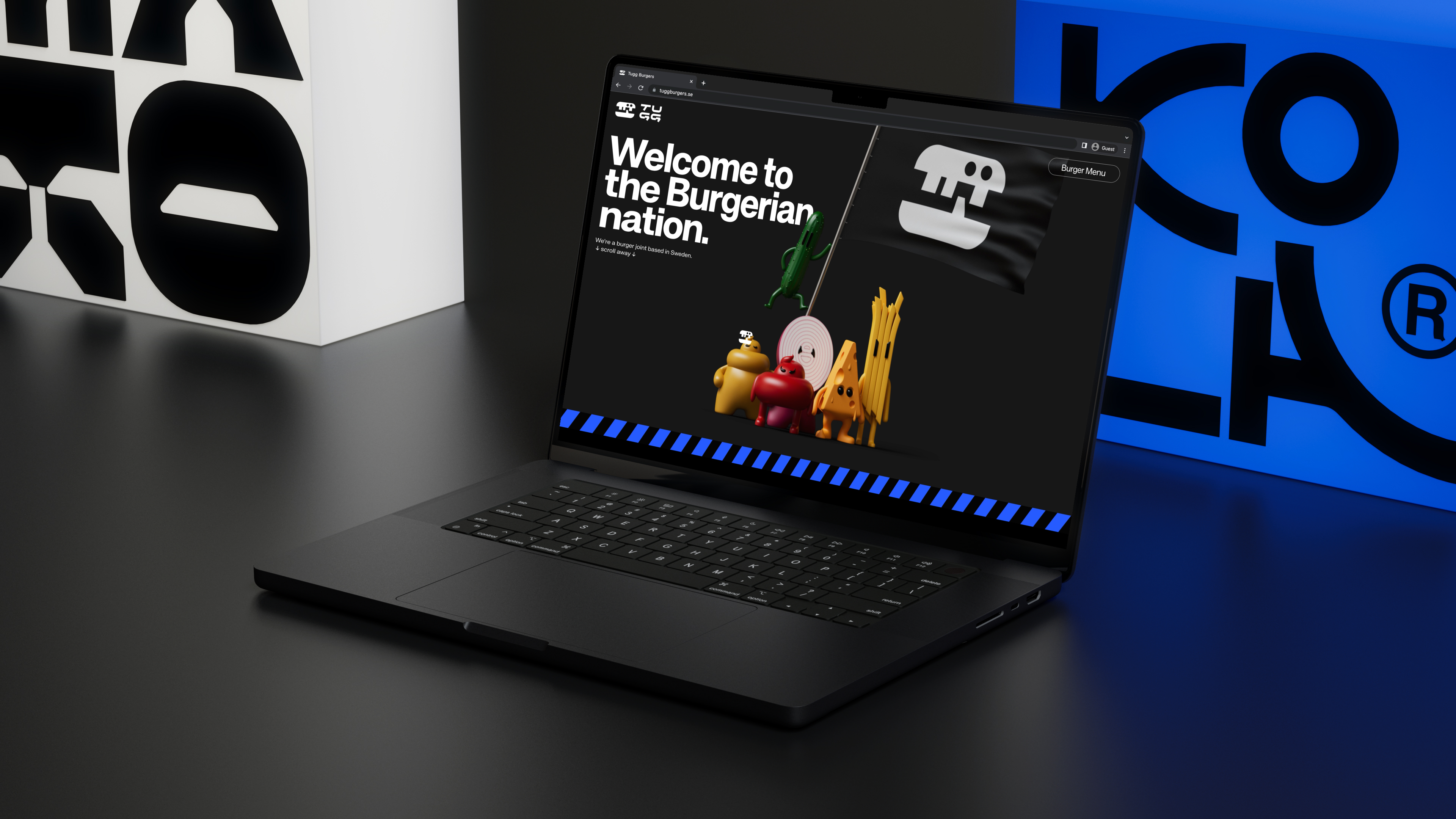


When Swedish burger joint Tugg needed to refresh the brand, there was an opportunity to break a long-established category behaviour and build in more soul, dynamism, and most of all, more representation of global cultures. With Sweden being a cradle for excellent food craftsmanship, it was a delicate mission to reimagine Tugg to create a stronger relationship with its target group.
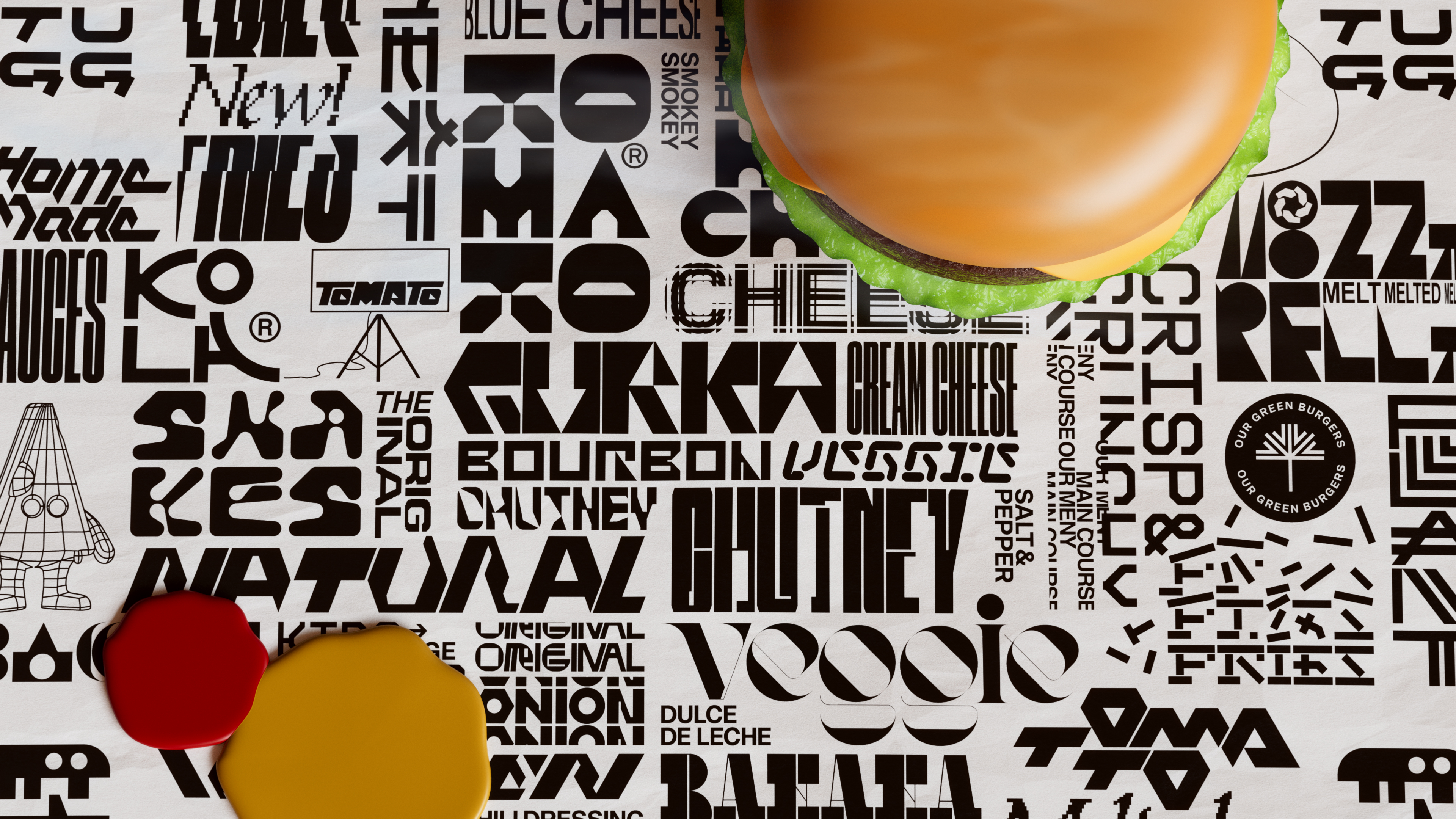
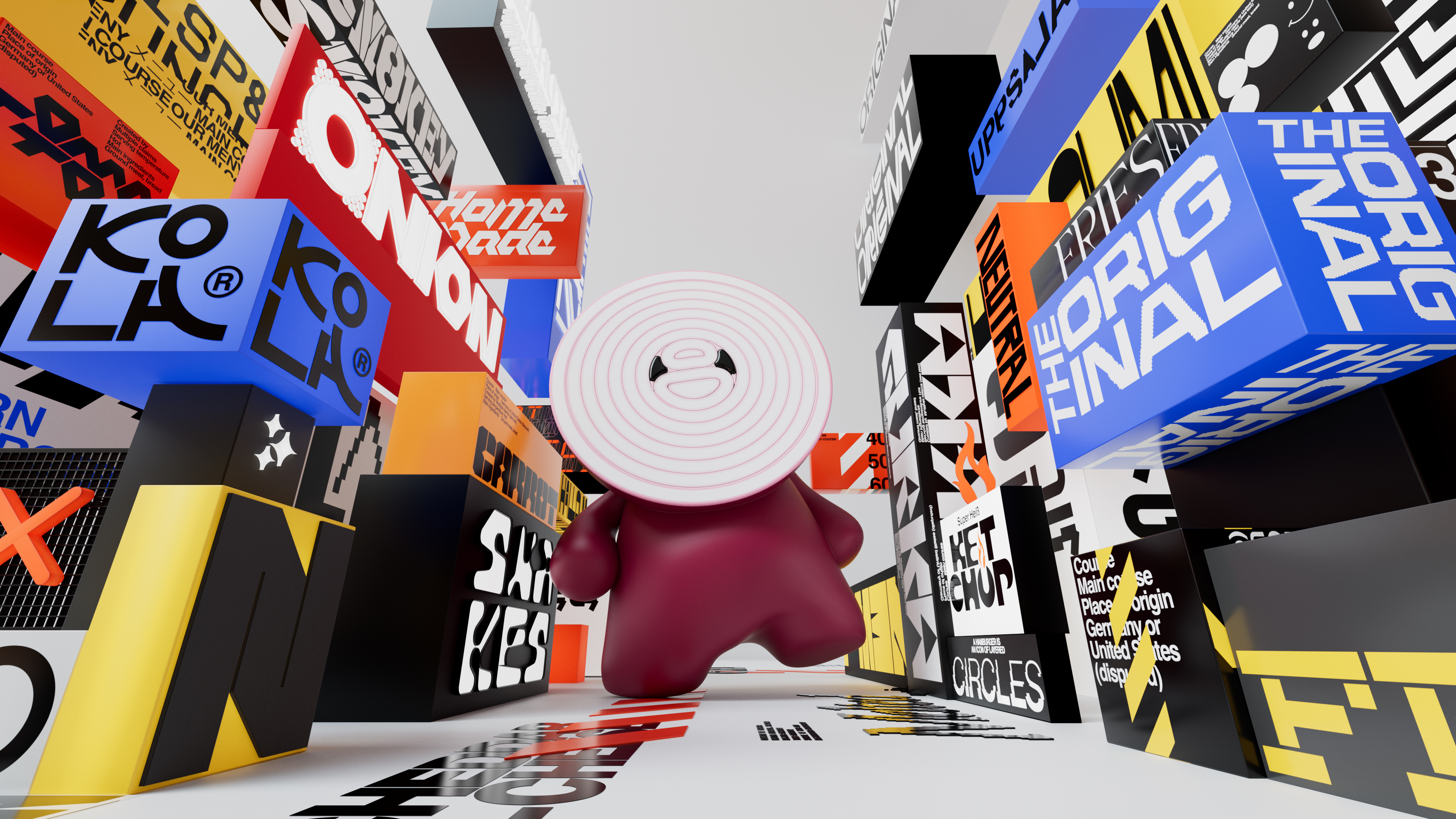
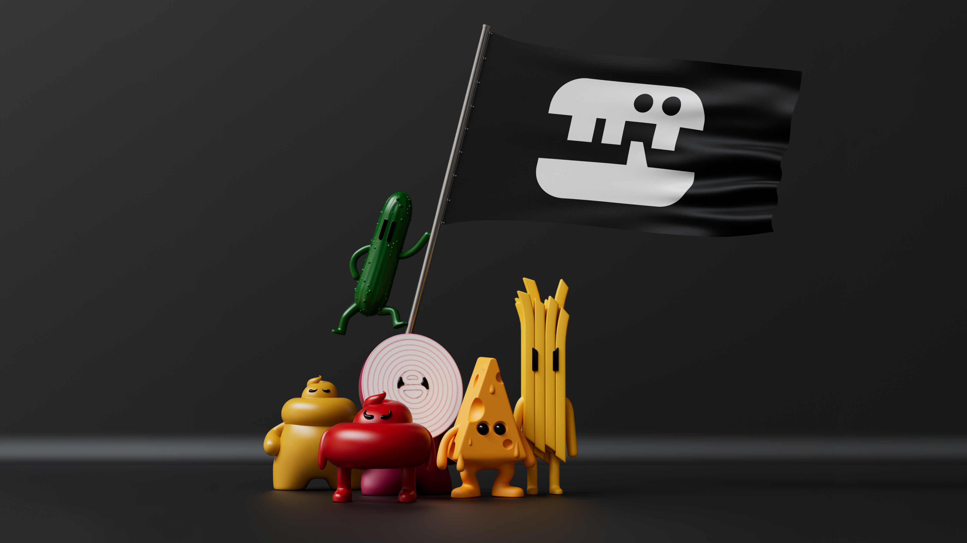
With this ambition, a visual world was created that moves far from the hamburger’s (debated) American origins, while still paying homage to the more traditional burger restaurant mascot and letting the ingredients do the talking. Accompanied by colourful graphics and wild typography, the Tugg family was introduced. These characters are a dynamic way of bringing the brand to life. The universe builds a perfect bridge between the characters and the graphical language.
The solution is an alternate take on a visual identity that brings in inspiration from around the world; with bespoke typeface and logotypes and characters. At its core, the visual identity is about the universality of the humble hamburger, and how it can be brought to life in new ways to welcome anyone and everyone through design.
